LatinoProsperity
2025 / Brand Identity
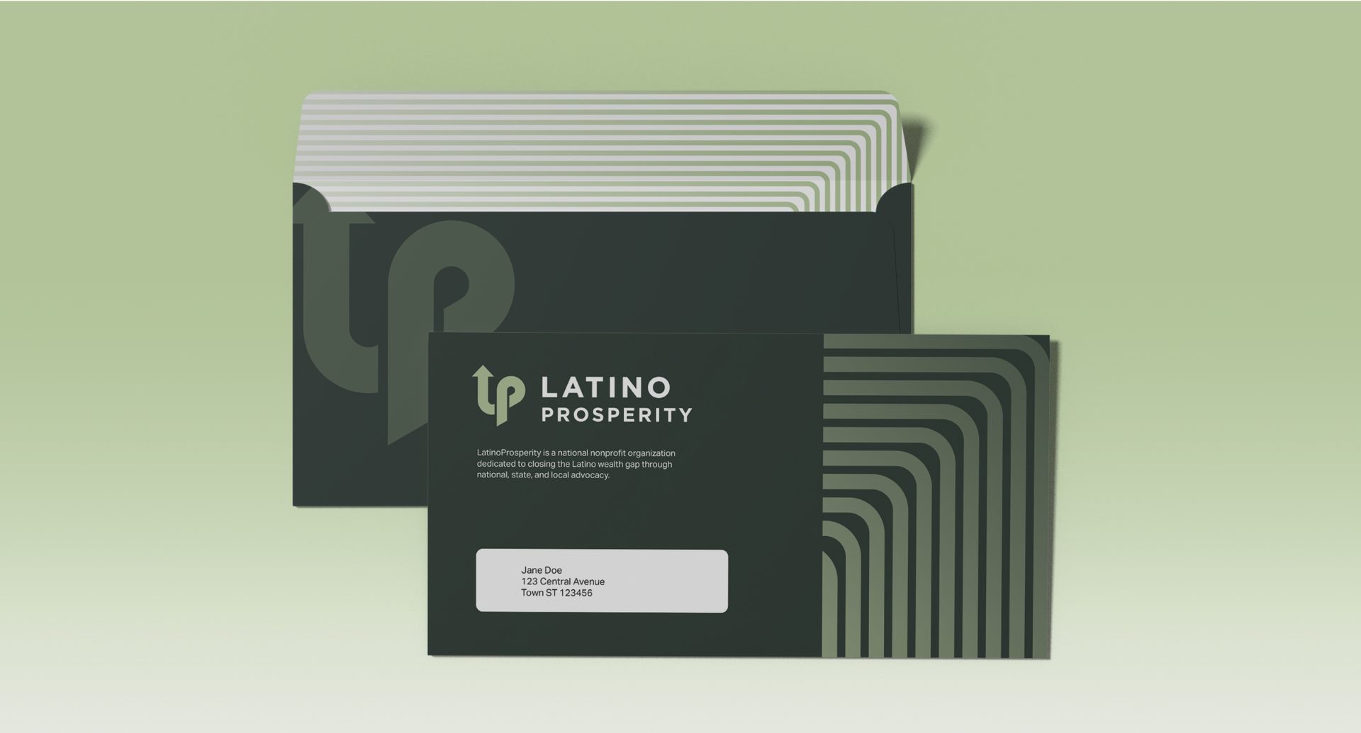
LatinoProsperity is a national nonprofit organization committed to closing the Latino wealth gap through state, local, and federal advocacy. Its work spans multiple interconnected areas, including access to capital, education, housing, and workforce development. However, to advance its mission effectively, LatinoProsperity needed a public-facing brand that could capture the spirit of relentless advocacy while communicating credibility and focus within the complex landscape of policy and economic justice.
Collaboration
Agency / Barretto
Creative Director / Steve Barretto
Project Manager / Jeff Plank
Art Director / Nick Kain
Senior Designer / Milton Cheng
The challenge
Our challenge was to develop a bold, confident identity that could engage funders, policymakers, community leaders, and Latino communities while signaling an unwavering commitment to building generational wealth and opportunity.
The outcome
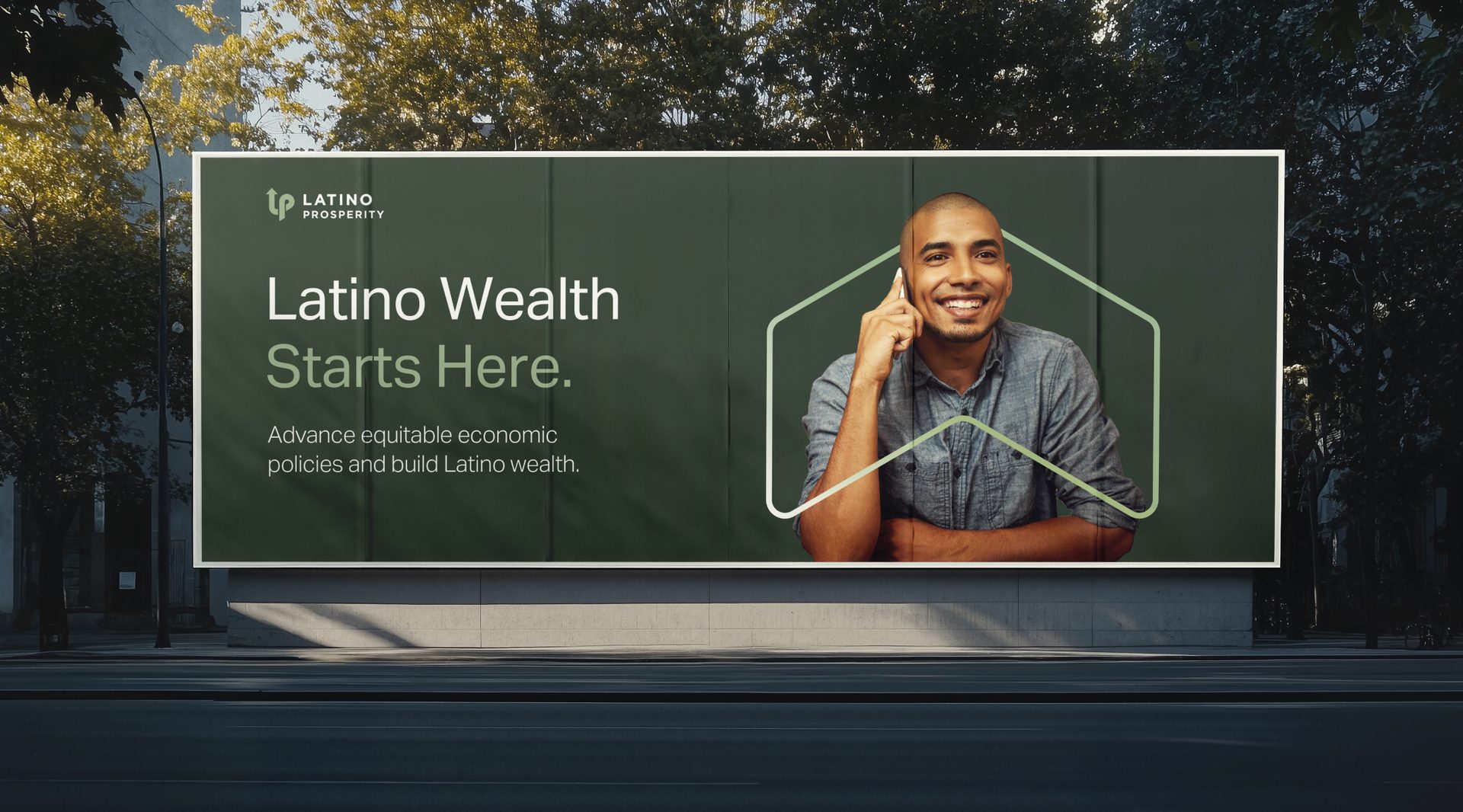
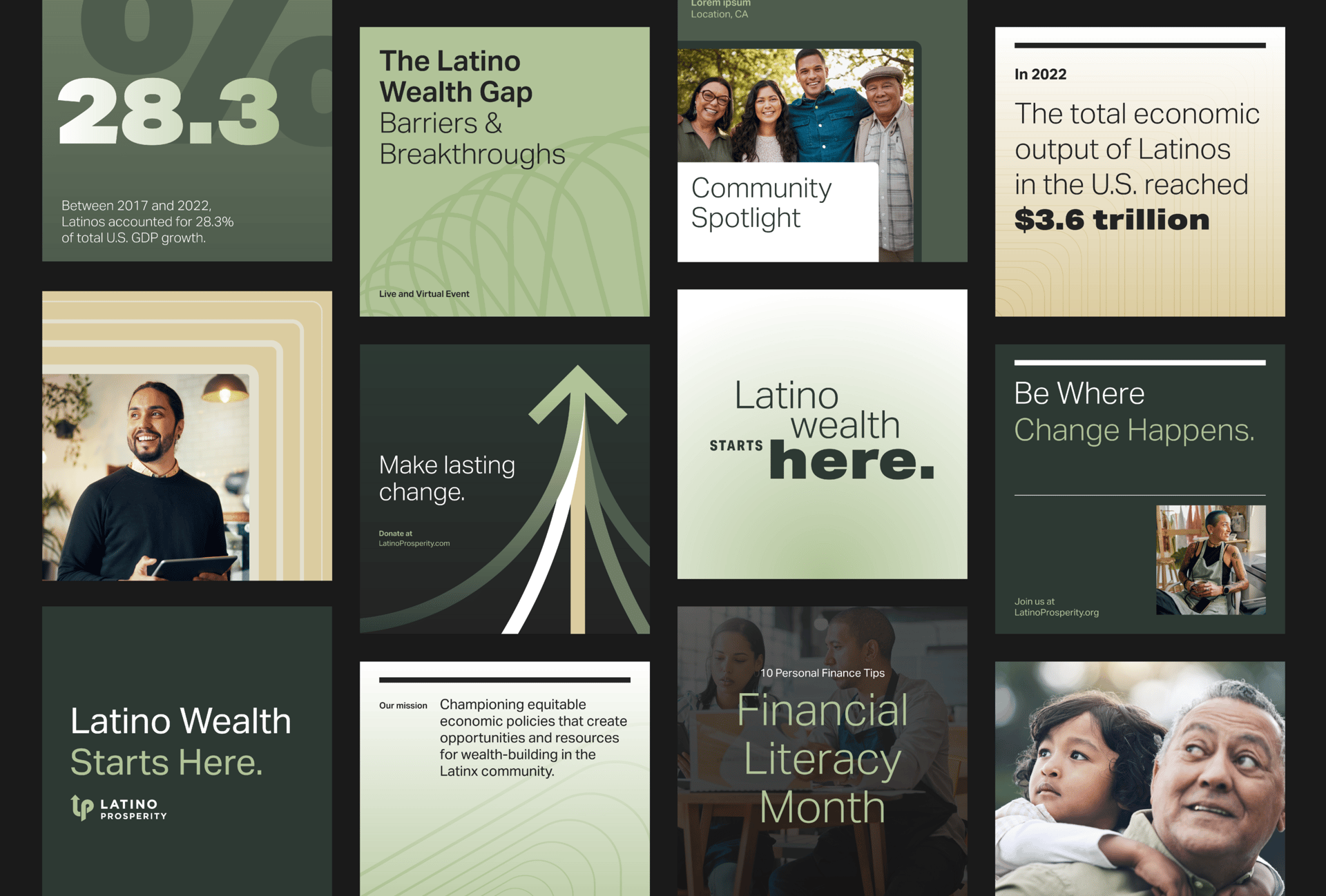
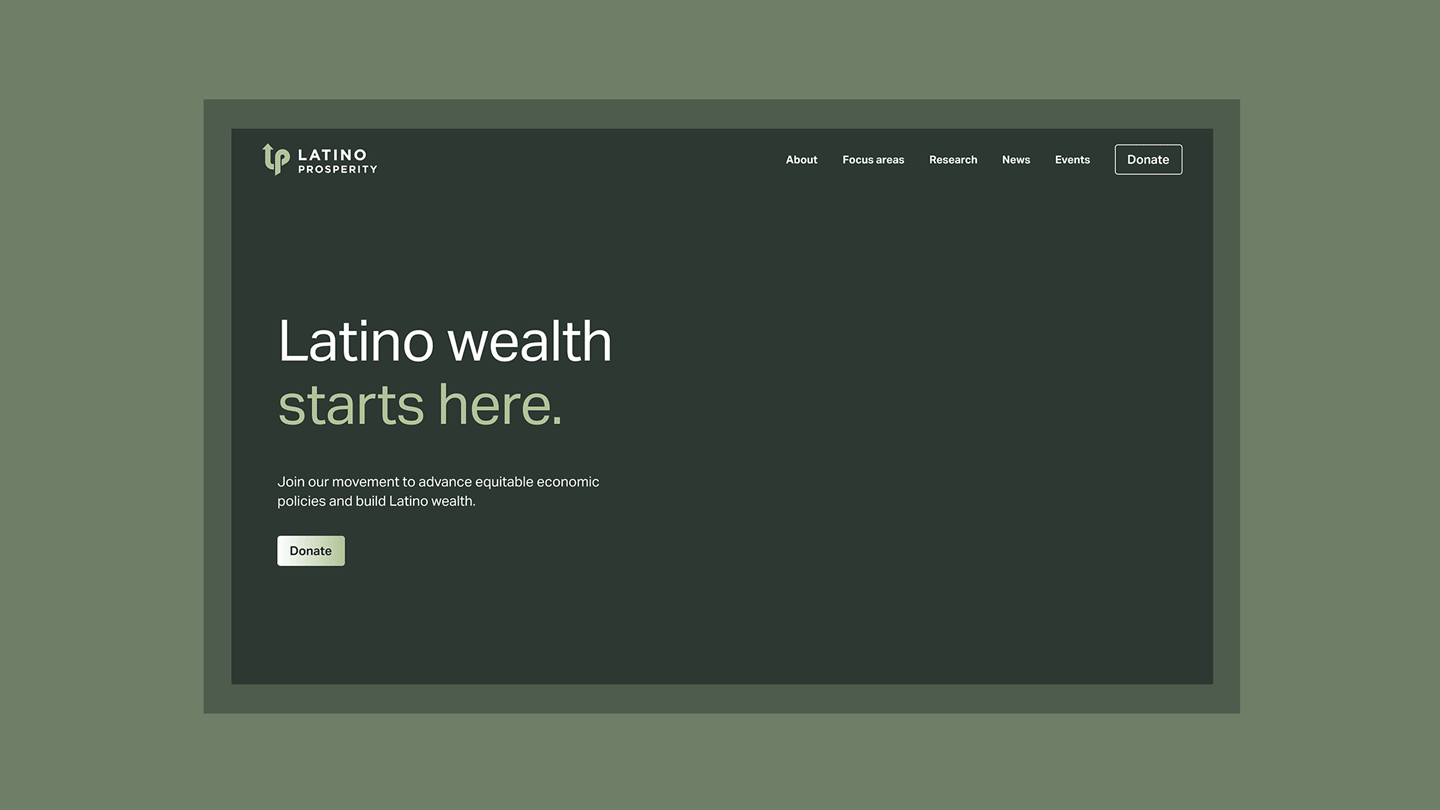
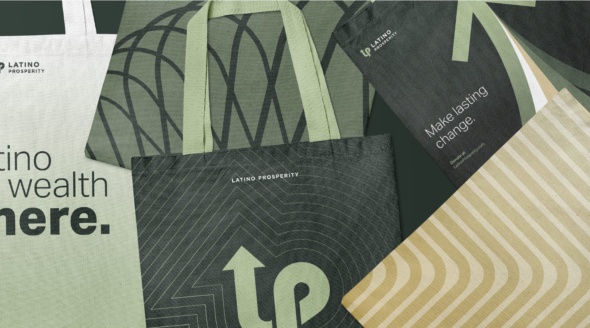
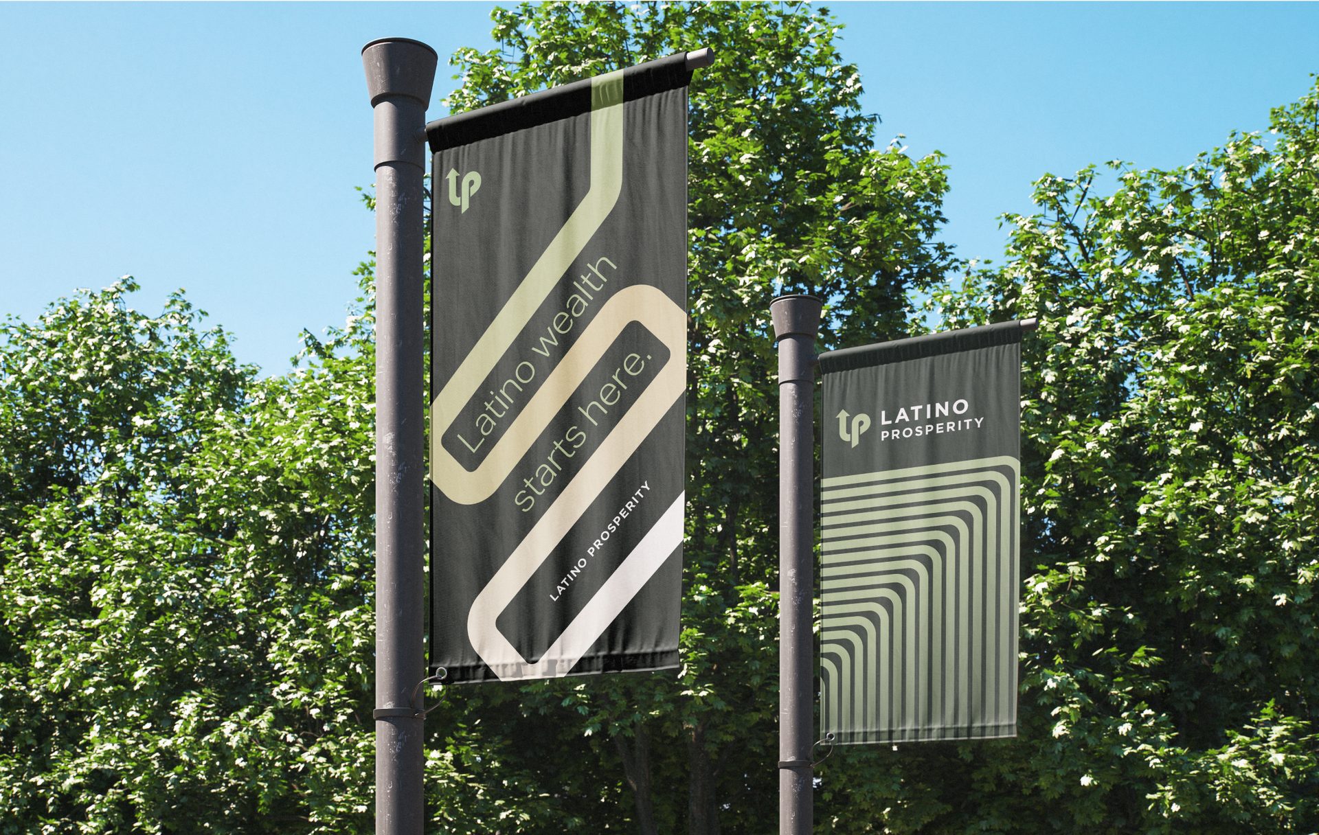
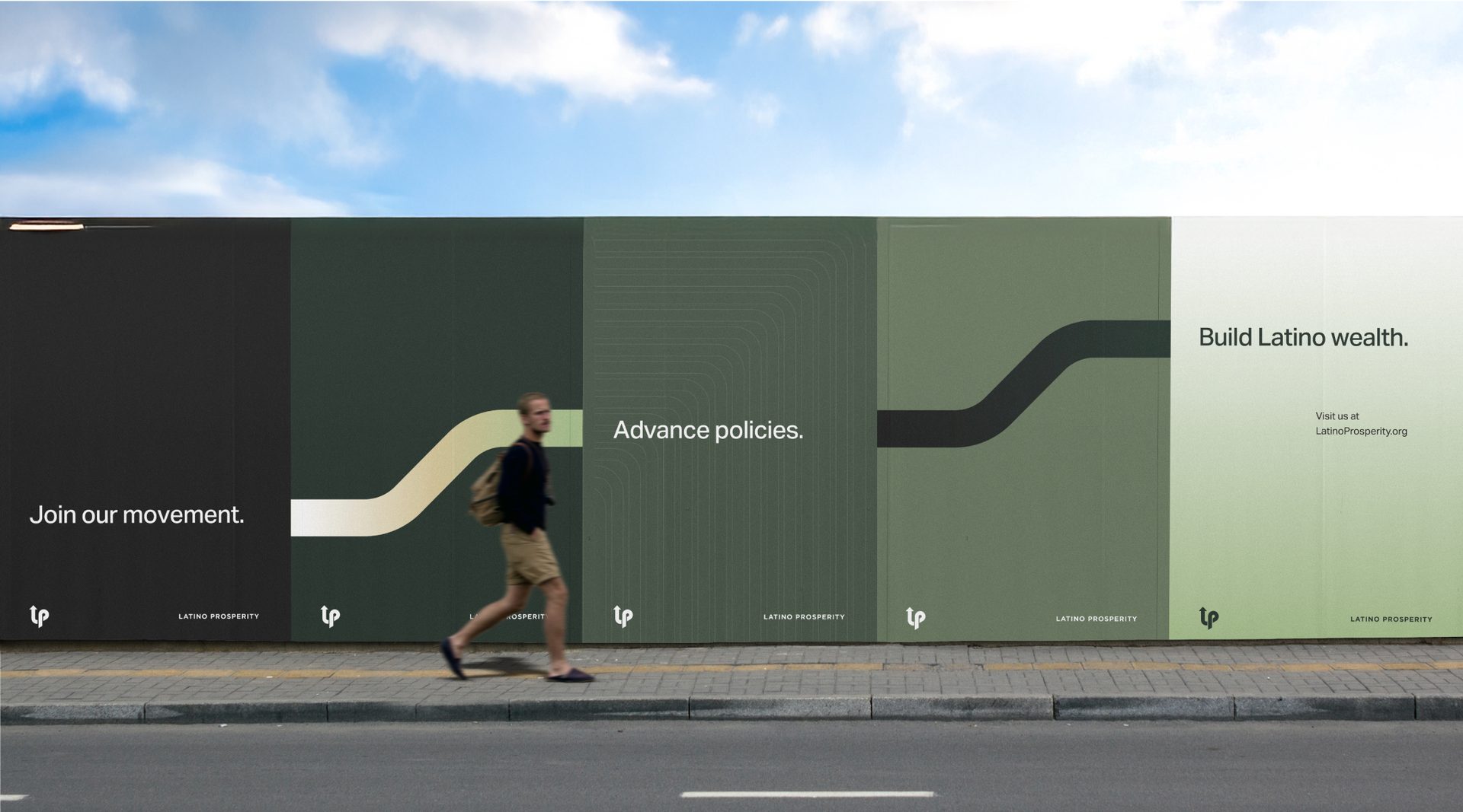
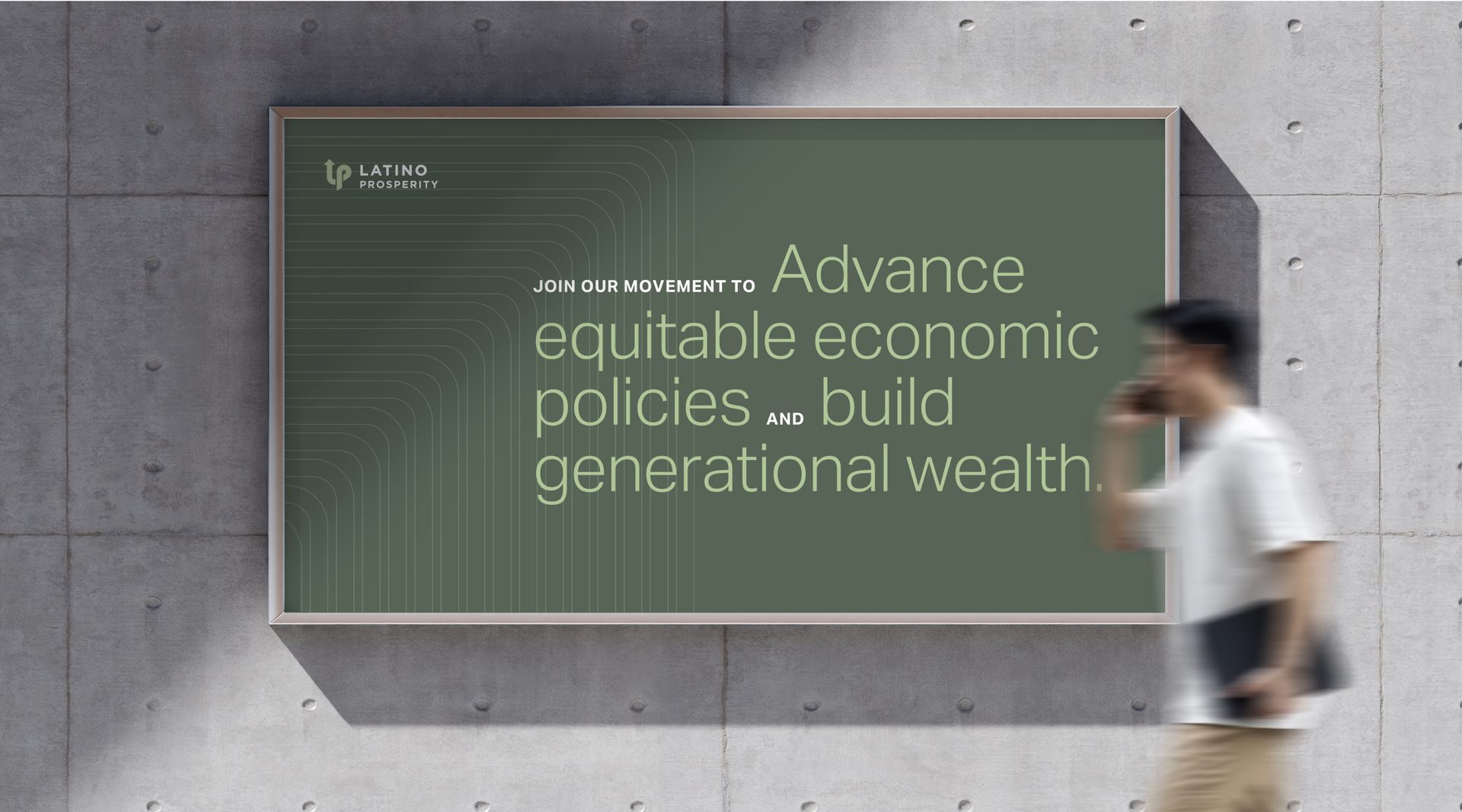
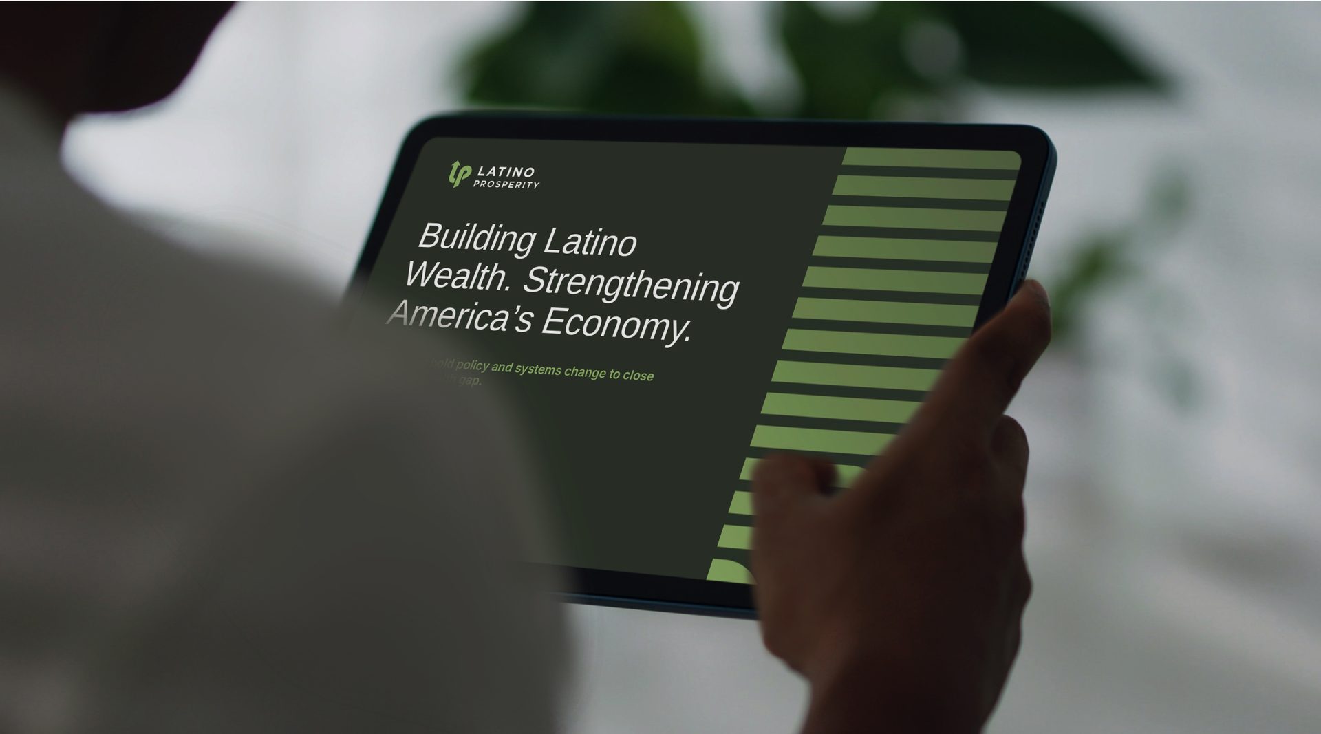
The visual identity system was designed to convey movement, action, and interconnectedness. We combined dynamic forms and bold typography to express advancement and unity, using a color palette that intentionally referenced the “finance” sector, a space from which Latinos have often been systemically excluded.
Delivered
Brand strategy
Messaging framework
Identity guidelines
Visual toolkit
Website design
Marketing collateral
The challenge
Our challenge was to develop a bold, confident identity that could engage funders, policymakers, community leaders, and Latino communities while signaling an unwavering commitment to building generational wealth and opportunity.
The outcome
The visual identity system was designed to convey movement, action, and interconnectedness. We combined dynamic forms and bold typography to express advancement and unity, using a color palette that intentionally referenced the “finance” sector, a space from which Latinos have often been systemically excluded.
Delivered
Brand strategy
Messaging framework
Identity guidelines
Visual toolkit
Website design
Marketing collateral
LatinoProsperity
2025 / Brand Identity
LatinoProsperity is a national nonprofit organization committed to closing the Latino wealth gap through state, local, and federal advocacy. Its work spans multiple interconnected areas, including access to capital, education, housing, and workforce development. However, to advance its mission effectively, LatinoProsperity needed a public-facing brand that could capture the spirit of relentless advocacy while communicating credibility and focus within the complex landscape of policy and economic justice.
Collaboration
Agency / Barretto
Creative Director / Steve Barretto
Project Manager / Jeff Plank
Art Director / Nick Kain
Senior Designer / Milton Cheng
The challenge
Our challenge was to develop a bold, confident identity that could engage funders, policymakers, community leaders, and Latino communities while signaling an unwavering commitment to building generational wealth and opportunity.
The outcome
The visual identity system was designed to convey movement, action, and interconnectedness. We combined dynamic forms and bold typography to express advancement and unity, using a color palette that intentionally referenced the “finance” sector, a space from which Latinos have often been systemically excluded.
Delivered
Brand strategy
Messaging framework
Identity guidelines
Visual toolkit
Website design
Marketing collateral
ETHOS
Ethos
Generational growth
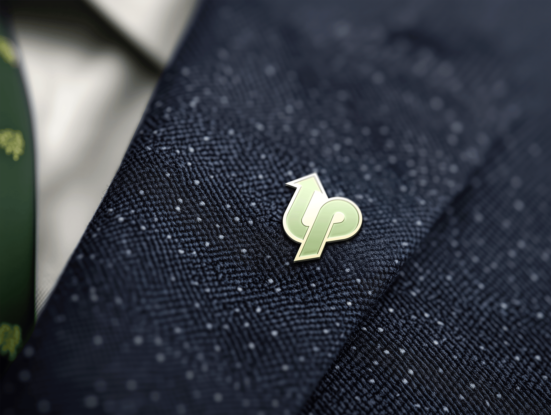
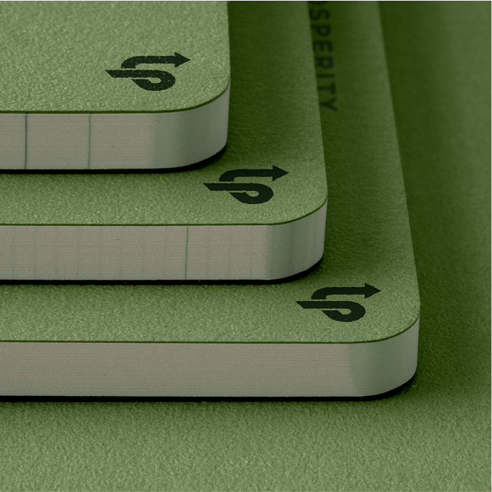
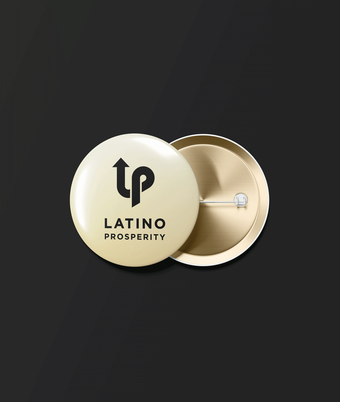
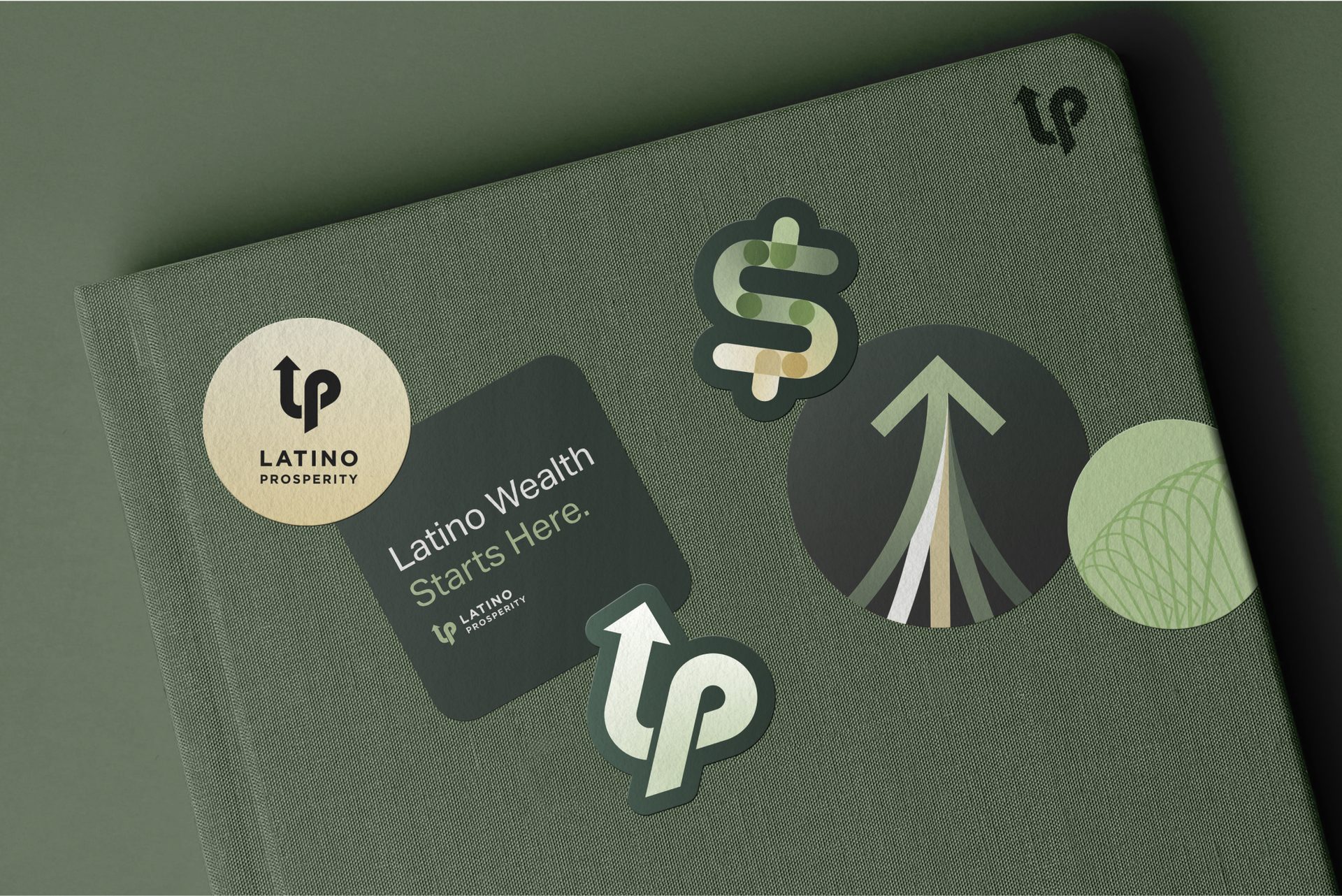
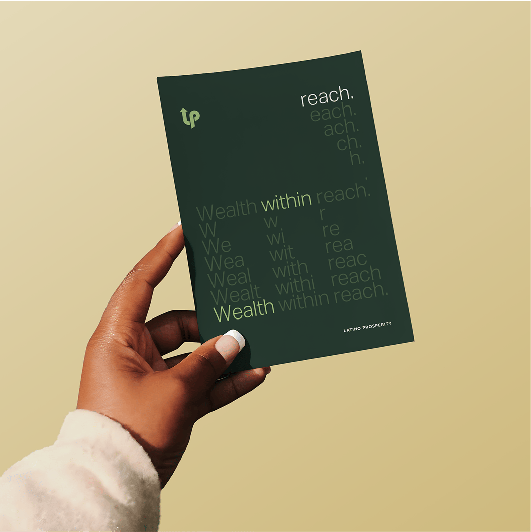
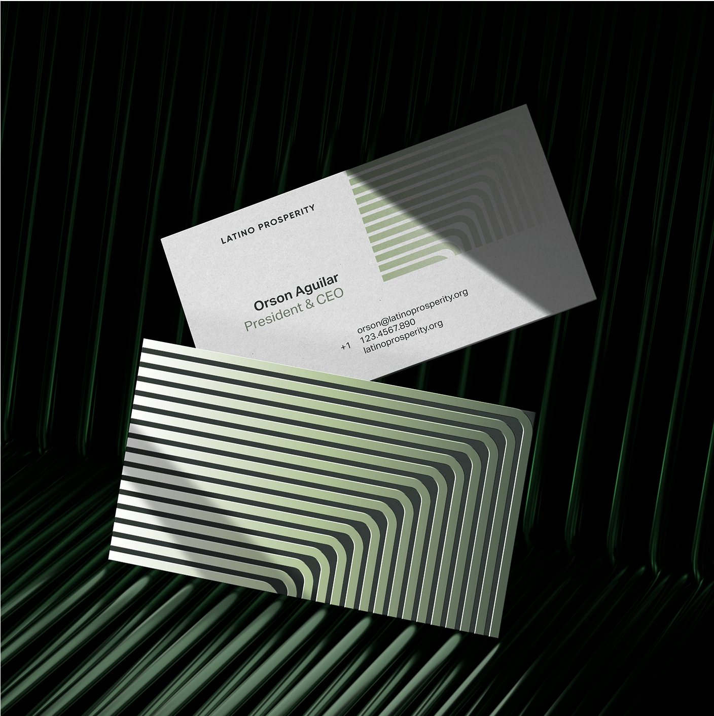
It all started with a strip of paper. By twisting, turning and shaping this unbroken line, we could create an “LP” monogram. This continuous line became the anchor for our system, and represents the roadmap LatinoProsperity is creating: a bold, deliberate path toward a future where the Latino community has the opportunity to grow generational wealth.
Logomark
Caption
Concept
Caption
Impact form
The impact forms are a visual expression of LatinoProsperity’s belief that progress begins with people. Each pattern starts from a single line — multiplied, echoed, and radiated outward — symbolizing the many voices, experiences, and walks of life that shape our movement. Just as a single action can create ripples through policy, community, and culture, these forms represent the cumulative power of collective impact.
Logomark
Caption
Concept
Caption
Focus areas
LatinoProsperity has 9 main focus areas where they leverage their efforts. Each focus area has a distinct branded icon that can be used to gain recognition and create impact.

Casestudy Title
2023 / Branding / Packaging / link@link.com
We do things a bit monke' around here.
Monkey Business is a San Luis Obispo-based surfboard repair shop run by a mixed bag of surfers who balance good times and craft. This rag-tag team was looking to expand their business and begin selling a surfboard repair kit.
I was brought in to create a new brand identity that reflected the vibrant personalities of this group, packaging that aligned with the brand, and keep the good times flowing.
Collaboration
Agency / Barretto
Creative Director / Steve Barretto
Project Manager / Jeff Plank
Senior Designer / Milton Cheng
Designer / Nick Kain
Designer / Andy Vera
Color Specialist / Patrick Dantino
The challenge
Our goal was to authentically represent the foundation’s DNA with a new, refreshed public image. The following overarching themes guided our efforts and design decisions: people/nature; harmony; joy/optimism; West Coast ethos; everlasting; between where we are now and net-new; great design: make it artful; nature is beautiful; and lastly, it must be legible.
The outcome
The A visit to headquarters and the family home, now a grantee meeting space, revealed a carefully curated design aesthetic with deliberate intentionality. Inspired by both environments, we developed the concept of a “weave”—a metaphor for interconnected ideas and efforts.
Delivered
Strategy & insight
Branding
Identity system
Web design